You spend hours designing the perfect website, and then you find out that there are a few things you missed. We have all been there. Unfortunately, these web design mistakes can be costly. This blog post will discuss web design mistakes that you need to avoid if you want your website to be perfect!
What Is Website Design And Why It Is Important?
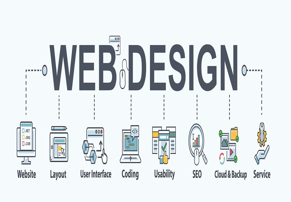
Web design is the process of designing a website’s appearance. It encompasses various disciplines, such as web graphic design, interface design, user experience design, authoring, and Search Engine Optimisation. Web design is a necessary skill for anyone looking to build a website. It is essential because it helps create the overall look and feel of a site. Additionally, web design is responsible for making sure a website is easy to use and navigate. With expanding online businesses, the need for web designing is rising. Companies search for efficient and cheap web designing services to boost their business. Your website can become a favourite of many by avoiding web design mistakes with a suitable layout.
Important Aspects of Website Designing:
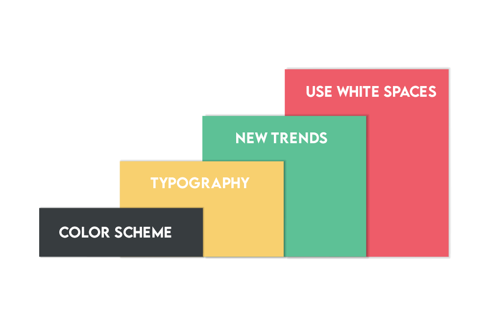
While there are many different aspects to web design, one of the most important is choosing a suitable colour scheme. The colours you use on your website can significantly impact how users perceive your brand. For example, using warm colours like red and orange can give the impression of excitement and energy. While using cool colours like blue and green can make a website seem more calming and serene.
Another vital element of website design is typography. Typography is the art of choosing and using fonts to create the desired effect. Different fonts can create different moods, and it is vital to choose the right font for the right website.
Website design is a constantly evolving field, and new trends are always emerging. Therefore, it is crucial to stay up-to-date on the latest trends so you can create websites that look modern and stylish. Some of the latest trends in web design include using flat design, large background images, and parallax scrolling.
Crucial Web Design Mistakes to Avoid for Perfection
A good web design is a key to a successful website. However, if you make any of the following web design mistakes, you could lose potential customers and damage your business’ reputation. This section will discuss web design mistakes that you should avoid.
Mistake #01: Ignoring Mobile Users
Almost everyone has a smartphone in the current times, so it is essential to make sure your website works well on all devices. Using different CMS (Content Management Systems) like WordPress or Wix can help because they automatically format your website to look good on mobile devices.
Ignoring mobile users is one of the biggest web design mistakes in the age of smartphones and tablets. If your website isn’t optimised for mobile devices, you could lose a lot of potential customers. Instead, use a CMS like WordPress or Wix to format your website for mobile devices.
Using a custom coding-based website, ensure the media queries are used properly and your website is loading perfectly on mobile devices.
Mistake #02: Not Having a Clear Goal in Mind
When designing your website, it is important to have a clear goal. For example, what do you want your website to accomplish? Do you want to sell products? Promote your brand? Drive traffic to your brick-and-mortar store? Once you know your website’s goal, you can design your website accordingly. This can be one of the most challenging parts of web design because it is hard to know where to start. We suggest starting with your target audience and designing your website accordingly.
Not having a clear goal in mind is one of the biggest web design mistakes. Without a goal, it is not easy to know where to start or what to include on your website. So make sure to have a clear goal before designing, and everything else will fall into place.
Mistake #03: Using Unprofessional Fonts
Using unprofessional fonts can make your website look unprofessional and amateur. It is better to use professional fonts that are common and easy to read. There are hundreds and thousands of different fonts to pick from, so take your time and find the right one for your website.
Using unprofessional fonts is one of the biggest web design mistakes. Instead, stick to professional fonts that are easy to read, and take your time to find the right one for your website.
Mistake #04: Not Using White Space Properly
If you don’t use white space properly, your website will be cluttered and difficult to navigate. Use plenty of white space to make your website easy on the eyes. A website that isn’t too crowded seems attractive and provides a better user experience.
Mistake #05: Making Your Website Too Complicated
Your website should be easy to navigate. If it is not, you’ll lose customers. So keep your website simple, and avoid adding too many bells and whistles.
Making your website too complicated is one of the biggest web design mistakes. Instead, straightforward navigation and fonts ensure a pleasing design and a great user experience, even for novice users.
Mistake #06: Not Optimising Your Images
If you don’t optimise your images, they will take forever to load and could cause your website to crash. Therefore, ensure that you optimise all of your graphics and images for the web. Website load time could be a significant conversion factor, and it can be easily improved by optimising the images on your site. Optimisation of your images also helps improve the website’s SEO, which is essential for any website. Not optimising your images is one of the biggest web design mistakes. So, don’t overlook the need for image optimisation.
Mistake #07: Not Using Alt Text
If you don’t use alt text, your images will not be accessible to people with disabilities. Therefore, always include alt text with your images. Alt Text helps users with disabilities to understand the content of your images. It is also essential for SEO, so include alt text with all of your images to get a top ranking on the search engine.
Mistake #08: Not Creating a Sitemap
Not creating a sitemap is one of the biggest web design mistakes. A sitemap is an important part of any website. It helps search engines find all of the pages on your website to index them accordingly. A sitemap is a great way to improve your website’s SEO, and it also helps users find all the pages on your website. Make sure to create a sitemap and share it with Google. You can easily use free plugins offered by WordPress to create sitemaps for your websites.
Mistake #09: Not Testing Your Website
Before you launch your website, make sure to test it on different browsers and devices. You don’t want any surprises once your website is live. Many immature developers launch their website without testing it, which is a terrible idea. Always do a test run of your website on different browsers and devices to ensure it works properly.
Mistake #10: Having Too Many Ads
One of the most common web design mistakes among bloggers is placing too many ads on the websites to generate extra revenue. But usually, this idea backfires and makes users leave. If you have too many ads, your visitors will be overwhelmed and may leave your website. There is no ideal number of ads per web page, but it is better to keep it to a minimum.
Mistake #11: Not Backing Up Your Website
Not backing up your website is one of the worst practices. Imagine losing all your files because of any virus, hacking attempt, or server crash. This could lead you to face a massive loss if it happens with your money-making website. It is crucial to back up your website regularly. You don’t want to lose all of your hard work if something goes wrong.
FAQS

1- What makes a bad Web page design?
Bad Web page design generally occurs when a web page designer focuses on flashy graphics and cool animations over usability. Some common problems with bad Web page design include using too many colours, using fonts that are difficult to read, intrusive pop-ups and ads, and not enough white space. When designing a web page, understanding the user’s point of view is the first and foremost thing. Think about what they will be looking for on the page and make sure the most critical information is easy to find. Use simple fonts and colours, avoid flashy animations and graphics, and make sure everything is easy to navigate.
2- What are the most common problems in a Website’s outdated design?
Outdated design is often associated with a lack of mobile responsiveness, cluttered or busy designs, and an overall lack of user-friendliness. In addition, many outdated websites feature dated fonts and colour schemes that can be jarring or difficult to read. Finally, many obsolete websites are slow to load or have complicated navigation menus that make it difficult for users to find the information they need.
3- What are the signs of good and bad Web Design?
Good web design is often characterized by a clean, fresh appearance with plenty of white space and easy-to-read fonts. In addition, navigation should be intuitive and straightforward, with links that are easy to identify. On the other hand, bad web design can be cluttered and confusing, with fonts that are difficult to read and links that are hard to find.
4- What are the typical website problems?
Many website problems can occur, and it depends on the website. However, some of the most common website problems include errors in coding, broken links, incorrect or missing images, and slow loading times. Additionally, websites can be susceptible to hacking and malware attacks, resulting in data loss or even complete website shutdowns.
5- What are design problems?
Design problems are anything that prevents a product from fulfilling its intended purpose. This can be a lack of features, confusing or poorly designed user interfaces, or any other number of issues. Design problems can cause a product to be less effective, less efficient, or just plain unpleasant to use. They can also lead to customer dissatisfaction and lost sales. However, good design is essential for creating successful products, so it is necessary to address any design problems as early in the development process as possible.
6- What is design failure?
A design failure can be several different things, but it usually refers to a difficult or impossible website to use. Other common design failures include: –
- Websites that are not visually appealing.
- Websites that are not easy to navigate.
- Moreover, websites that are not mobile-friendly.
A good website design should be easy to use, visually appealing, and mobile-friendly. If your website fails to meet any of these criteria, it is likely to suffer from design failure.
Conclusion
These are just a few web design mistakes that you need to avoid. If you take the time to fix these web design mistakes, you will have a much better chance of having a successful website. These days, a successful website guarantees a successful business. Read more about 11 Web Design Mistakes You Must Avoid.
