Graphic Designing is an art with a motive. It is the play of colours to achieve business aims—creativity, photography, and elaborate graphic design. By using interactive images, some ideas are projected into the user’s mind that supports the cause and aim of the business. For a better understanding of Graphic design, it is essential to understand the basics and essentials of Graphic designing, so let’s see the main elements, principles, and tools of graphic designing that provide you with a broader view and elaborate graphic designing clearer perspective.
Graphic Designing involves different types of design; for instance, some are picture-based designs that contain photos, illustrations, some logos and symbols, or it can be a type-based design or a mixture of both methods. Nevertheless, let’s see the essential elements of graphic designing.
Colour and Lines
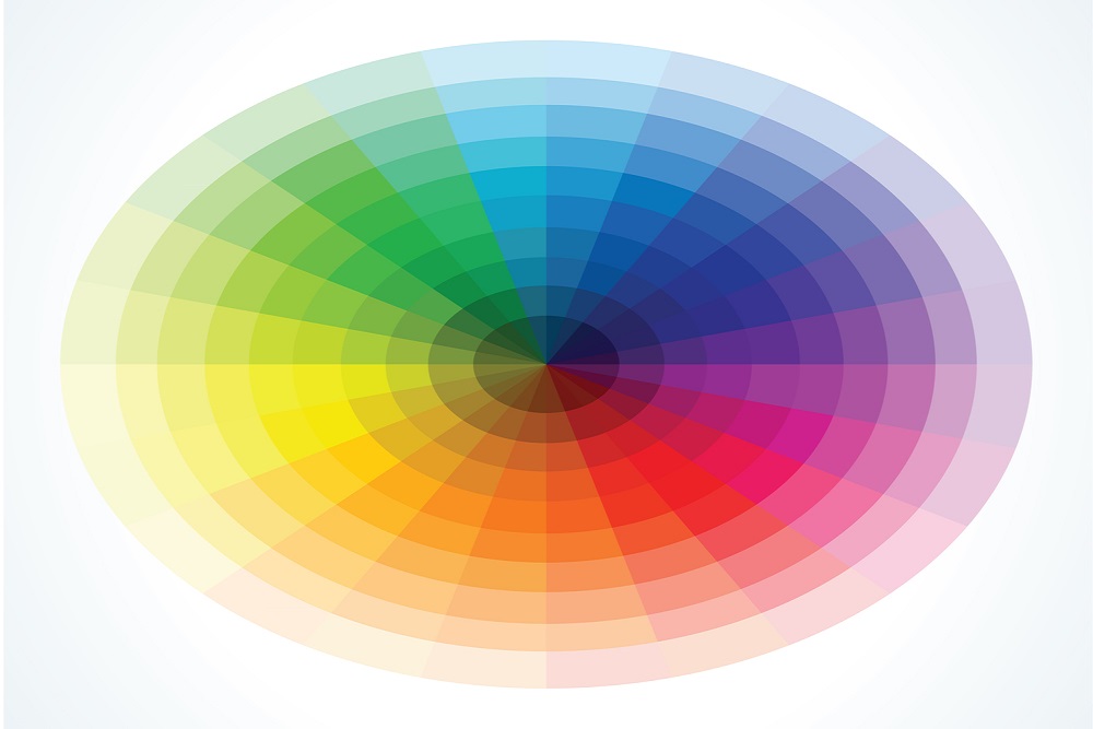
Colours are the heart of graphic design. In elements, colours are the most crucial element of graphic design. The absence of colours points out that there is no graphic design at all. This element is used in combination with other features like lines, shapes or topography. It is the colour that adds life to the picture or design and attracts users. Colours do have some characteristics as well i.e., the colour family. The second one is valued, i.e., how light or dark the colour is; the third is the saturation, i.e. the purity of the colour.
Lines can be of any type. Straight, curved, zigzag thick or thin. Designers need to check lines according to the design. Whether they have to use short or long lines, the main aim is to fit well to the graphic designing. There is no limit to the type of lines. Hence, to connect two or more points, lines are used. They can be used for different purposes, for instance, for dividing space and directing the user’s attention in a direction the designer wants.
Size and Shapes
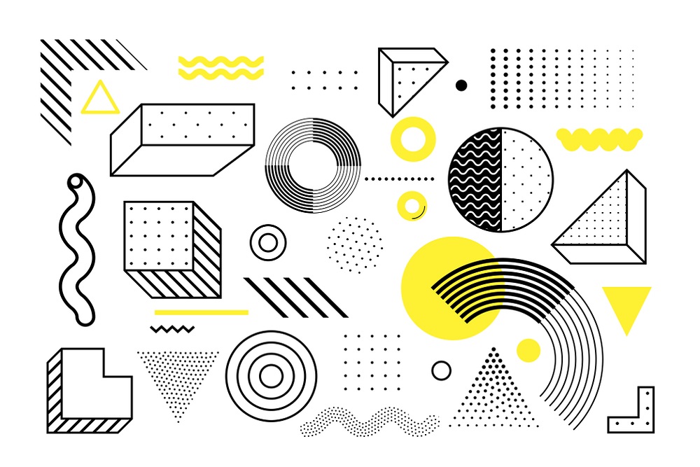
The size of a design says a lot about it. In Graphic designing, size is something that determines the importance of an element. Designers use contrasting sizes to draw the attention of the people. In addition, different sizes are used to make a design more dynamic.
Shapes also play a role in creating a design. With the use of lines, a shape is an area that has two dimensions. Shapes can be of any type of geometric, circles, abstract or organic shapes. Also, triangles, rectangles or squares can be used. As similar to colours, shape also has some associations. Sometimes a circle is used to show unity, whereas a square may be used to show structure. A shape depends on the colour and style of the background, which influence the user’s view.
Space is another important element of graphic design. It gives all the elements room to shine. Space increases the readability for texts or view of elements for the one reading or viewing it. Space must be included between all the design elements, according to the area where it is required. For example, below, up, around or in between any elements. Spaces are placed in a design to emphasise the areas or elements of designing to look amazing. The space placement sense is an essential aspect of graphic designing, without which any outstanding design can lose its beauty.
Texture and Typography
Textures give an impression of a design in reality. As if how they will look like if they are touched. It can provide a feel of a design, whether smooth, soft, rigid or shiny. It helps in giving a three-dimensional look. Moreover, it includes paper, stone, concrete, brick or fabric. Sometimes textures are used to add depth to a design.
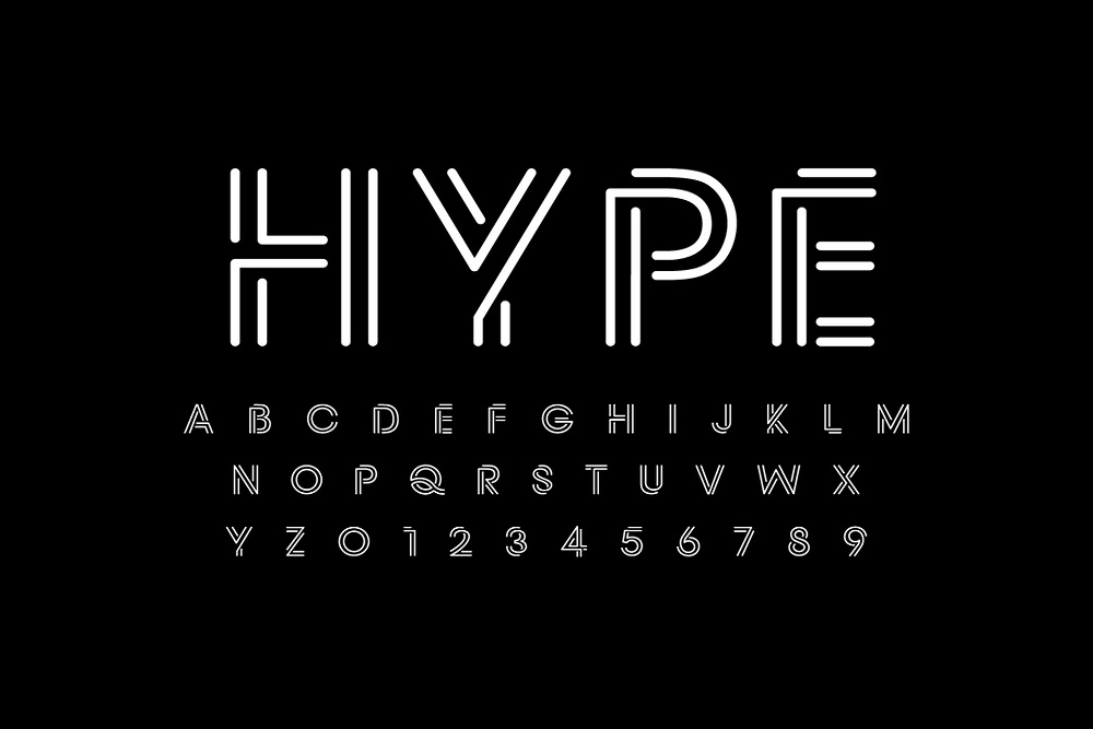
In graphic designing, texts create an exciting visual if they are arranged clearly and attractively. Topography is a way of arranging texts in a fantastic and captivating way. A suitable topography provides balance and a fascinating view. It must create a strong visual hierarchy.
Principles of Graphic Designing
Some principles of graphic designing must be followed as they are essential for a design to look more effective. The basic principles are
Balance and Alignment
In graphic designing, achieving visual balance is very important as it provides the design with stability and a good structure. Both symmetrical and asymmetrical designs are used in graphic design. Balance means balancing shapes, lines and other elements. All things are distributed evenly. Hence, if both sides of the design are not the same or equal, they contain an impression of balance by having similar elements.
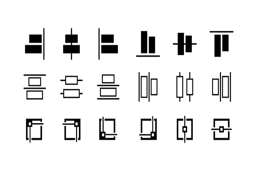
Alignment is something that adds clarity to a design. All elements in a design must be aligned. A strategy is made and followed in this case as some elements are aligned with the top. Other with the centre and bottom. Some elements are aligned with the sides if this fits in the way of displaying a good look.
Highlights and Proximity
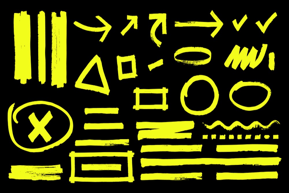
Emphasising specific aspects of design is what is referred to as highlights. Stressing the vital elements among all the others is what makes a design complete. A design must highlight some aspects for a more incredible look. It is that part of graphic designing that is in practice for a more extended period.
Proximity means that elements of a design that are related must be close together. It means that the features that are unrelated to each other must be apart. Graphic designers understand the theories of visuals; hence, the organisation of elements in such a way that connections between them doesn’t break and provides an excellent visual experience.
Organised design is not just created by following the principle of proximity. It is also enhanced by repetition. Repetition in graphic designing means the repetition of your elements or patterns to have consistency within the design. It is done by repeating the elements in the design, for instance, lines, fonts, colours, same shapes with similar sizes. This repeated action creates harmony and enhances balance among the design.
Movement and Proportion
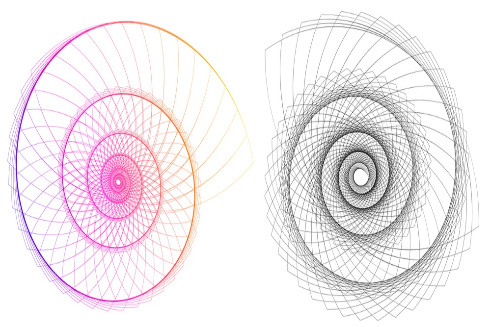
The movement principle is followed in graphic designing, keeping in mind the information to transfer to the user correctly. Elements are composed so that the eye movement happens so that it moves from one element and is stuck to the next one and so on. Thus, it tells a story and engages the viewer while the message is perfectly communicated.
Proportion is the relevance of two or more elements in the arrangement and their comparison with each other in size, colour, degree, and placement. Proportion creates harmony if a correct linkage exists between the elements in terms of size and quantity. If the elements are equal in size and distribution, they are called to be proportional. If one picture is more prominent or looks more significant than the other, it is called out of proportion.
Tools of Graphic Designing
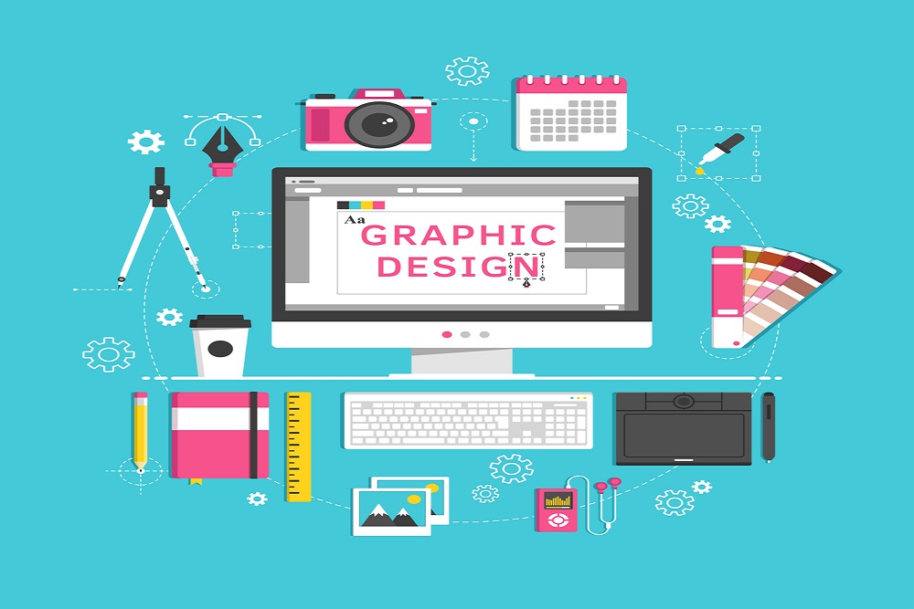
Graphic design has revolutionised over time because of digitalisation and technological advancement. Besides, it doesn’t mean that traditional graphical designing tools are forgotten.
Co-founder of Duckpin Design, Birenbaum, said that the ideas need to work first on paper and later the computer should be used as a tool to bring life to the concept. So, let’s start with the classical to modernised graphic designing tools.
Sketchbooks
A classical tool used to display ideas. It is the fastest method to note down the first sketch of the concept, which designers can foster further utilising different tools and innovations. Sketchbooks are also used nowadays in the initial stages of designing.
PCs
Computers presently possess a must tool in each designer’s kit for a must list for designing. Tablets that are a modified form of computers also allows designers to extend their artistic liberty and keep up that sketchbook feel while making designs on digital devices.
Software
Technology has provided designers with an abundance of software that they can use for better graphic design. There are plenty of designing software. Some need to be purchased, and some are free. For example, Illustrator and Photoshop can assist with making illustrations, beautifying photos, modifying text styling, and synergising the entirety of the pieces in unique layouts.
Graphic designing also involves presenting your brand and your message visually with great business logos, brochures and newsletters with a captivating impact and beautiful posters.
Conclusion

Although graphic designing is a vast concept that involves plenty of designs, the meaning and essentials of graphic designing will make you start graphic designing better as you understand all the principles and musts of graphic designing. You now need to select a type of graphic design that fits well with your brand, and you can start all on your own.
